Monday, September 30, 2013

See What Yvette Tipton is Creating!

 
Art Piece: 
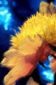
“Wild at Heart”
Acrylic
14”  x  11”
 
About the Artist:
Yvette Tipton
Yvette was born and raised in San Francisco.  She began drawing and sculpting at 5yrs old.  Yvette believes art is an expression of the inner person, expressing thoughts and ideas that are meant to be shared.
 
To view more of Yvette’s work and the work of all our fine artists, visit us at www.contemporaryartgalleryonline.com.   Also check out our monthly art competitions.

Friday, September 27, 2013

See What Tara Francosie is Creating


 Art Piece 
“Butterflies”
Gel Pens and Chalk on Paper
17”  x  14”
 
About the Artist
Tara Francosie
Tara Francosie is from Portland, Oregon but everyone there calls her Tara, so we will as well.  Tara is new to the art world but her drawings are full of vibrant colors.  Her images can be described as delicate, intricate and full of life and dimension.
The Artist’s Statement
“All my art is done with gel pen and chalk on paper.  A very simple approach but the results are intriguing and original.   This is my recovery without my art I would be lost to a world of Darkness.  I want to share it with the world.”
Francoise Moisan, but everyone calls her Tara is new to the art world.  Her images are bright, vibrant, intriguing and full of life and dimension.    Her drawings are completed with gel pens and chalk.  Visit us at Contemporary Art Gallery Online and view Tara’s collection of work.  You will be enthralled as we were. 
To view more of Tara’s work and the work of all our fine artists, visit us at www.contemporaryartgalleryonline.com.   Also check out our monthly art competitions.
 

Wednesday, September 25, 2013

Let's Be Careful Out There by F.M. Kearney


A shutterbug is washed out to sea by a sudden wave, while precariously perched on a precipice during a raging storm. Another is mauled by a grizzly after snapping a close up of its cub. We've all heard stories of photographers putting themselves in harm's way just to get a shot. I, however, choose not to go out like that – opting instead to place my equipment in the line of fire. Of course, I don't want to lose that either, but I'm pretty sure it would be a little easier to get another camera than another me.


During the fall, I like to head out to the Thain Family Forest in The New York Botanical Garden. The autumn colors are especially brilliant around the Bronx River that runs directly through it. One of the best vantage points is from Hester Bridge which spans the river near a small waterfall. Some of the most interesting scenes are located almost directly below this 100-year-old, camelback structure. I like to compose shots of the colorful, overhanging foliage with the river raging beneath. I could just lean over the side of the bridge and hand-hold the camera to take the shot, but I wouldn't get a soft, silky look in the water. That requires a longer exposure that can only be done with a tripod. My tripod is specifically designed for outdoor work with independently adjustable legs, so that it can be securely positioned on even the most rugged of terrain. Somehow, I don't think the manufacturer considered the edge of a bridge as a “terrain.” Nevertheless, that's exactly where I had to place it to get these shots. With one leg on the bridge, another braced against its stone retaining wall and the other free-hanging out over the edge, it wasn't exactly secure, but stable enough to support the camera. After attaching the camera to the center-post, I extended it far out over the edge – hoping that my quick-release mechanism wouldn't suddenly decide to release.

 
I don't remember what the exact exposure times were for these photos, but they were probably around a half second. Normally, I'd use a longer time to get a silkier look to the water, but I didn't want to risk having the leaves blur out. Although calm, the winds were still noticeable. A longer exposure would not have maintained the necessary sharpness in the majority of the leaves.

It's easy to get lost while photographing the beauty of fall...just remember to stay safe to avoid a nasty fall while doing it.
 

Article Submitted By:
F.M. Kearney is a fine art nature photographer, specializing in unique floral and landscape images. To see more of his work, please visit www.starlitecollection.com.

Tuesday, September 24, 2013

Summer with Phillip Harvey by Jayme Catalano


Philip Harvey captures the essence of scorching summer days and balmy nights in his most recent body of work.  Ironically, the commercial photographer who captures the essence of summer lives in San Francisco, a city well-known for its year round chill.  His cheerful, colorful images capture the melting decadence of ice cream, the sophisticated luxury of French macarons, and the nostalgic joy of soda.  For more information and additional images from his portfolio, please visit his website here.


Image titles:  Hotdogs, Ice Cream, Macarons, Lights, Sodas by Phillip Harvey


Article Submitted by:
-Jayme Catalano
http://jaymecatalano.com
Graphic design and site creation


Monday, September 23, 2013

See What Pete Mair is Creating!


Art Piece 
“Foley Sunset”
Acrylic on Unstretched Canvas
5’   x  7’
 
About the Artist
Pete Mair
Pete was born in Neptune, New Jersey, which is very close to the ocean.  Living close to the water is something Pete missed very much, while living on Atlanta, Georgia.  It was in Atlanta where Pete began his professional career as an Artist.  He joined as artist group in Atlanta and was accepted into a few local galleries, where he began selling both his original paintings as well as his reproductions.  Pete is born to an artistic family.  His brother is also a painter.  Pete came to art late in life.  He felt that art belonged to his brother.  So Pete pursued music.  These days you’ll catch Pete playing his music as well as creating beautiful art.
Pete considers his art to be somewhere between realism and impressionism.  Pete works with watercolors, gouache, and acrylics.  Pete enjoys painting a wide range of subject matter. 
 
To view more of  Pete’s work and the work of all our fine artists, visit us at www.contemporaryartgalleryonline.com.   Also check out our monthly art competitions.

Friday, September 20, 2013

See What Sean Koziel is Creating!


Art Piece: 
“Jazz”
Acrylic
30”  x   40”
 
About the Artist:
Sean Koziel
Sean Koziel is an artist from Illinois.   Sean enjoys working with acrylics and oils.   Sean mostly paints landscapes, but has completed many abstract and Neo-Geo art.  Sean likes to take photos of places of where he has traveled.  Once back in his studio, Sean then tries to capture the atmosphere of the moment in his paintings.  Sean graduated from Illinois State University in 1998, with a Bachelor's degree in Fine Art.  Sadly after college he stopped painting.  In 2008, Sean was drawn back to his canvases.  Sean hopes that his paintings convey a mood, capture a moment, or build an environment for which the viewer can relate.  All us here at Contemporary Art Gallery Online, are very pleased Sean found us.  We believe his work is majestic, mellow, and skillful.  We encourage everyone to view his work and of course purchase a piece today!  Enjoy
 
To view more of Sean’s work and the work of all our fine artists, visit us at www.contemporaryartgalleryonline.com.   Also check out our monthly art competitions.

Tuesday, September 17, 2013

Circle Squared by Jayme Catalano

When independent game developer John Nelson Rose approached me about branding, marketing, and designing the user interface for his new puzzle game, I couldn’t have been more thrilled. The task granted me the opportunity to combine my skills in graphic design with interactivity while challenging me in ways I had never imagined.

I started the process by thinking about names for the game. It was important to the
developer that the title be simple, relatively short, and very descriptive of the game play itself. The central game mechanic is moving columns and rows of colored circles left and right, up and down to make two-by-two (or larger) squares. The name “Circle Squared” seemed the most fitting.

Once the name had been settled upon, I moved forward with designing the look and feel of the game. Inspired by a mid-century, minimalist design aesthetic, I settled upon using the font Century Gothic in white against black, all lower case with certain of the round spaces filled in with coordinating colored circles. The resulting menu and in-game screens are minimalist and very bold.

Establishing a color story that was pleasing to the eye and true to the branding of the game proved to be a bit of a trial and error process. In addition to coordinating beautiful colors that showed well against a saturated black background, I also had to make sure that the order in which the colors appeared in progressing difficulty levels was finely-tuned to avoid certain combinations. The resulting palette of plum, canary yellow, salmon pink, avocado green, cool red, warm baby blue, tangerine, and denim blue has been universally praised by those who have played the game.  If you don’t believe me, download the game and see for yourself.

While it’s a small start, I’m so excited to have officially launched my “indie” game career and I look forward to future collaborations.  Check out John’s website for details on upcoming title releases.

Article Submitted by:
-Jayme Catalano
http://jaymecatalano.com
Graphic design and site creation

Creative Flower Photography Tip #8: Colorize the Background by F.M. Kearney

Several years ago, while standing in line at a camera store, I began thumbing through the pages of a book about photographing flowers. I came across a section showing a studio set-up of a single rose wrapped in blue tissue paper in a cone-like fashion. The finished photograph was a close-up of the rose with a decorative blue background.

Since my “studio” is the Great Outdoors, I thought of ways I could employ this technique in the field. Most of my flower shots are done in botanical gardens. Since the groundskeepers probably wouldn’t appreciate having their blooms wrapped up like FTD bouquets, I decided to place the paper on the ground behind the flower.  This, in fact, worked out much better. Due to the close proximity between the paper and the flower in the book illustration, you could clearly see that the material was tissue. In my improvised version, with the paper several feet away, it became nothing more than a soft color wash.
 
If you want to take it a step further, try using Mylar paper. Mylar is a highly reflective material, often used as an elegant gift box liner. When crumpled up and reopened, its wrinkles reflect light like a glistening, crystal chandelier. The effect is most pronounced in direct sunlight. For a multi-colored effect, I've created customized backgrounds comprised of several randomly-sized and colored pieces of both types of papers. I glue them to 3X3 square foot pieces of cloth that can be easily rolled or folded to fit almost anywhere.

For best results, I use each type of paper in only certain types of light. Tissue paper works best in the shade or on overcast days, but Mylar does its best work in direct sunlight. If it’s used in any other type of light, no highlights will appear at all. This can be a real headache if you’re shooting on a partly sunny day – when the sun is constantly playing “peek-a-boo” behind the clouds. There can be, however, too much of a good thing. Large concentrations of highlights can produce distracting “hot spots.” If that happens, I simply smooth out the paper to reduce some of its reflective surfaces.
 
It’s important to keep in mind that you’re just dealing with the background. These stunning effects can very easily dominate the photo, and draw attention away from the real subject. If you’re not careful, they can even become downright distracting. I come in very close on the flower, so that the background covers little more than the outer fringes of the frame – using extension tubes for greater magnification if necessary.

You can also top off these effects by using a soft-focus double exposure technique, whereby, one image is shot in focus and the other one is completely out of focus to create a dreamy, romantic look. If the background is a little too close to the flower and in danger of being recognized as paper, this will definitely blur it to the point where its mystique remains intact. Lastly, for best results, you should use a lens with a focal length of at least 200mm or more. You won’t get the degree of softness you need with anything shorter, and the effect will look more like a mistake (as though you bumped the camera during the exposure) than a deliberate attempt to soften the image.

These techniques will help to transform your flower images into what I like to refer to as, “Fantasy Florals.”

Article Submitted by:
F.M. Kearney is a fine art nature photographer, specializing in unique floral and landscape images. To see more of his work, please visit www.starlitecollection.com.


Monday, September 16, 2013

See What Michael Tolleson is Creating!


Art Piece: 
“Checkpoint”
Acrylic
24”  x   36”
 
About the Artist:
Michael Tolleson
Michael Tolleson‘s art travels between two paths; one more realistic and the other more abstract and soul based.  Michael usually begins by observing and reviewing a photo of a place, person, building, sky or a landscape.  The photo acts as a tool to isolate whatever interests Michael, and in the process, the ordinary will reveal something extraordinary about its place in his world. These images provide the “bones” of his work.  Michael absorbs the feeling of the image and what develops on the canvas is the feeling on adrenaline!  The moment, the feeling and the colors are punched up.  Michael’s paintings capture the essence of that moment; a feeling; a future.
Michael is strongly influenced by the Asian culture and his approach to his paintings’  style emulates a “Sumi-E” artist’s manner of addressing his art form.  Michael’s brush or palette knife movement is quick and almost manic, although the application of the paint is calculated but yet appears random on the canvas.  Color and emotions pour from the finished canvas to draw the viewer deeply into the art. Ultimately, Michael hopes the paint on the canvas provides a doorway into his world and will capture his desire to touch another receptive soul.
To view more of Michael’s work and the work of all our fine artists, visit us at www.contemporaryartgalleryonline.com.   Also check out our monthly art competitions.

Friday, September 13, 2013

See What Mark McDonnell is Creating!


Art Piece: 
“Switch Bench”
Black pine, oak, poplar, and steel 
36”x118”x18”
 
About the Artist
Mark McDonnell
Mark McDonnell is a Master Carpenter and has been designing for 30+ years.  Mark has become known for his custom work and installations.  Happily married for 27 years; he and his wife Laura have five wonderful children.  Mark creates his magnificent work in his studio, which he has named Black Snake Furniture.  Mark named his studio after the mated pair of black snakes that quietly share his shop with him.
To view more of Mark’s work and the work of all our fine artists, visit us at www.contemporaryartgalleryonline.com.   Also check out our monthly art competitions.


Wednesday, September 11, 2013

Better Days by F.M. Kearney


The seasonably unpredictable days of spring had arrived. Bare branches left frozen and raw for months, were slowly being adorned by a billowing tapestry of light green foliage. Flower bulbs lying dormant and forgotten just below the surface of the cold Earth, were gradually releasing their colorful offspring into the world.

Although the weather can sometimes be unpredictable, this annual spectacle of nature is not. My days of spring had become commonplace – almost routine. Each year, I photographed the usual daffodils, cherry blossoms and tulips. However, I would always bypass the tulip display at the World Trade Center on my way to work across the street. The tulips decorated the planters in the plaza area between the towers. Being a nature photographer in an urban environment like New York City can be a challenge, especially if you don’t own a car. However, I had learned to develop shooting around obstacles like streetlamps, traffic and buildings into quite an art form. People are often amazed to learn that some of my most stunning imagery was actually created in the heart of the Bronx or downtown Brooklyn.

Since avoiding man-made objects in my nature shots had always been a top priority of mine, I never considered the WTC tulips a worthwhile photo opportunity. I could never figure out how to shoot them artistically in such a confined area. Depending on the time of day, the plaza would be filled with vender carts, tourists taking pictures, workers hustling back and forth, or musicians performing for the lunchtime crowds – not exactly a prime backdrop for creative nature photography. The biggest obstacles, of course, were the towers themselves, which I viewed as “in the way.” 

For some reason, I had a change of heart in Spring 2001. Succumbing to the “if you can’t beat ‘em, join ‘em” mentality, I decided to include the buildings in the shot. On a clear April morning, I shot a series of low-angle close-ups with a 16mm fisheye lens. The extremely wide view enabled me to capture the tulips and the towers with room to spare. A right-angle finder comfortably allowed for an even lower than normal perspective, and a lens setting of f/22 brought the foreground and background into perfect focus. I don’t normally use this lens due to its extreme barrel distortion, but in this particular case, I felt it served as an appropriate aesthetic element.


I learned a lot of things from the pictures I took on that cloudless day. As one of my first attempts at deliberately combining natural and man-made objects, it’s clear that the two don’t always have to remain exclusive. Great images can be made by the skillful juxtaposition of these two worlds. Sadly, five months after this scene was captured, it was wiped away forever, along with the now dismantled Deutsche Bank building where I used to work. That taught me to never to take things for granted – things I might even consider obtrusive. Perhaps my most sobering realization was that this was a time of innocence – a time when everything was right with the world. Those seemingly “routine” days of Spring ’01 truly were better days.

Article Submitted by:
F.M. Kearney is a fine art nature photographer, specializing in unique floral and landscape images. To see more of his work, please visit www.starlitecollection.com.

Tuesday, September 10, 2013

Digital Collaging by Jayme Catalano

German artist Catrin Welz-Stein creates her works by digitally collaging old illustrations and photographs.   She combines, divides, removes, fills and retouches elements in Adobe Photoshop to produce digital images that explore the worlds of fantasy and fairy tale.  She says her images, “speak from inner feelings which we often hide in our daily life.”  A former professional graphic art designer, she feels free from the rules and compromises she felt in creating art for clients.  She now enjoys “creating art that does not explain itself from the beginning.”  Based in Malaysia, she says “a large part of my work is the search for license-free images, illustrations or photophos, for which the copyright has long expired.  Old books, magazines and the Internet are my primary resources for that.  Once I have found a fitting image, I break it into pieces, until the original image is no longer recognizable and an entirely new image is created.”  Visit her website to see more of her images or purchase the artwork at Redbubble.

 
Article Submitted by:
-Jayme Catalano
http://jaymecatalano.com
Graphic design and site creation

Image titles are in order of display:  Summer Dreaming, Her Garden and Frau Holle

Monday, September 9, 2013

See What Lynette Slape is Creating!


Art Piece: 
“Inner Peace”
Acrylic on Canvas
24”  x  36”
 
About the Artist
Lynette Slape
Lynette is an art student, working on her bachelor’s degree in art and creative writing.  She enjoys writing; however painting is her love.  Lynette’s portraits are bold and zesty, with a little attitude sprinkled on top.
To view more of Lynette’s work and the work of all our fine artists, visit us at www.contemporaryartgalleryonline.com.   Also check out our monthly art competitions.

Friday, September 6, 2013

See What Katie M. Puenner-Gray is Creating!


 Art Piece: 
“Almost Fall”
Oil on Canvas
18”  x   24”
About the Artist
Katie M. Puenner-Gray
Katie  began painting at Luther North High.   Katie attended Columbia College in Chicago, where she earned a BFA in Art & Design.  During Katie’s freshman year of college, she worked as an apprentice artist at Gallery 37.   Katie then progressed to the Art Students League, in New York.
Since then, Katie has been featured in one person and group shows throughout Chicago and New York. In addition, Katie has designed and painted dozens of murals for New York schools, events, homes, and historical sites like the Stanton Island Ferry Station for a NYC Best Chefs reception. Katie has also collaborated with fellow artists to create a “Peace” mural for Lasalle Bank seen by thousands daily on the Kennedy Expressway.
Katie’s recent work can be seen on the cover of a new book entitled “Zero”.
To view more of Katie’s work and the work of all our fine artists, visit us at www.contemporaryartgalleryonline.com.   Also check out our monthly art competitions.
 

Wednesday, September 4, 2013

The Brooklyn Bridge Waterfall by F.M. Kearney

New York is a city known for its attractions: The Empire State Building, The Statue of Liberty, The Bronx Zoo, The Brooklyn Bridge...Waterfall?  For a brief period, in the summer of 2008, there actually was such an attraction, thanks to the imagination of artist, Olafur Eliasson.

The Brooklyn Bridge Waterfall was part public art project, consisting of a series of four artificial waterfalls situated along the East River and the New York Harbor. They were created by pumping river water up and over 100 foot tall scaffoldings.

Like a typical New Yorker, I suppose, I never really paid much attention to public art installations. But, a waterfall flowing under the Brooklyn Bridge is something you don’t see every day. From a photographer’s standpoint, it was something I just had to shoot.

In the light of day, the falls didn’t look like much at all, but after sunset, they were illuminated and became much more impressive. The one placed under the Brooklyn tower of the Brooklyn Bridge was the most picturesque. Combined with the regular bridge lights, it became a nightly photo-fest with scores of photographers lining the banks of lower Manhattan with tripods to get a shot of this unusual spectacle. For this image, I used a shutter speed of several seconds to give the water a silky look – a common technique I use with real waterfalls.

The waterfalls were taken down in October. I have to admit, I was a little sorry to see them go. It takes a lot to stop jaded New Yorkers in their tracks. Whether they loved it or loathed it, I think many would agree that this art project was certainly one of a kind.

Only in New York!


Article Submitted by:
F.M. Kearney is a fine art nature photographer, specializing in unique floral and landscape images. To see more of his work, please visit www.starlitecollection.com.

Tuesday, September 3, 2013

The Girly Whirl by Jayme Catalano


Before the golden age of photo manipulation, extreme breast augmentation,  Penthouse and Victoria’s Secret, randy men the world over turned to pin-up art for a thrill.  The artwork reflected the rampant consumerism of the mid-century, offering sexuality as a product: processed, packaged, and sold.  Mostly anonymous, the women in the paintings are coy, sexual confections in fantastical settings.  The images reflect a bright, sanitized, and Caucasian reality where feminism has no place.  Gil Elvgren was the best pin-up artist the world has ever known, at least according to his own website.  Like his contemporary Norman Rockwell, Elvgren also worked from staged photographs, changing facial features, expressions, and atmosphere at will in the final painting.  And like many of Rockwell’s illustrations, the paintings present an idealized vision of American life.  Click here to read more about Elvgren.

Article Submitted by:
-Jayme Catalano
http://jaymecatalano.com
Graphic design and site creation


Monday, September 2, 2013

See What Sharon Hawkshawe is Creating!

 
Art Piece: 
“Time”
Acrylic on Canvas
18”  x  24”
 
About the Artist
Sharon Hawkshawe
Sharon Hawkshawe was born in Dayton, Ohio, and raised in Columbia, Maryland.  Her mother is a published author and her father was an artist and architect before his death.
Sharon has been painting all of her life, specializing in the use of acrylic and oil paints. 
Sharon’s topics cover the most basic of human experience through the use of abstract and impressionistic landscape work.
Sharon’s work has been viewed in Washington D.C., Miami FL, Fort Lauderdale FL, Tampa FL, Orlando FL, Key West FL, Johnson City TN, Charlotte NC and more. 
Sharon also co-authored a book of poetry under her num de plum Sharon Belle, entitled Songs of the Soul.  Her artwork is also featured throughout, including the front cover. 
Sharon is currently awaiting release of her newest book of poetry, entitled A Soul Speaks.  This book will also feature illustrations by her.  A Soul Speaks is due to release in  2014.
 
To learn more about Sharon Hawkshawe, view her work that is for sale, or learn more about her books; visit www.HawkshaweGallery.com.
 To view more of Sharon’s work and the work of all our fine artists, visit us at www.contemporaryartgalleryonline.com.   Also check out our monthly art competitions.